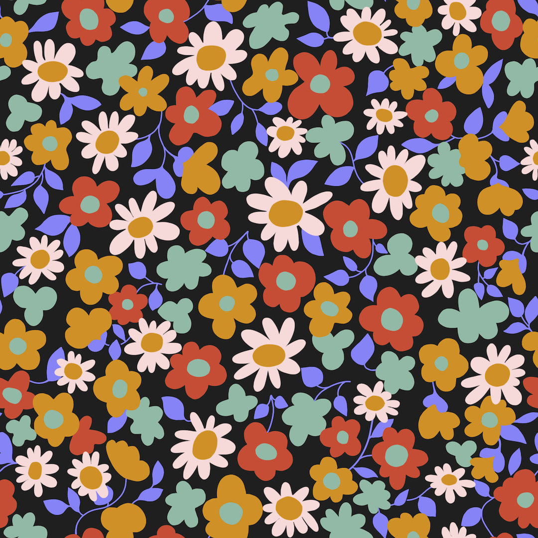
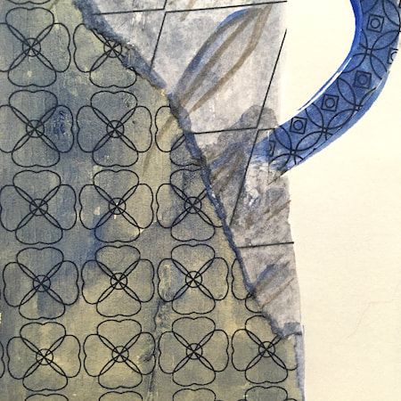
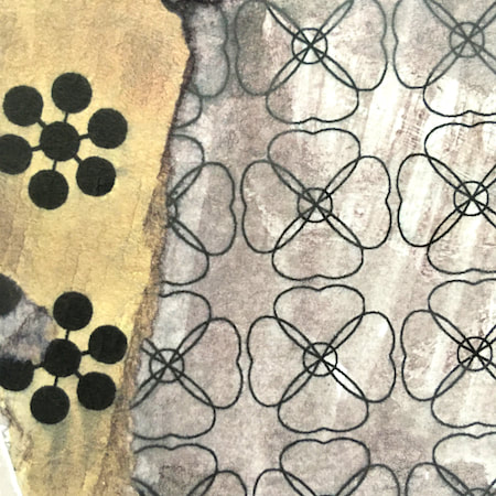
 I came across a Spoonflower printing review on the wonderful Tuppence Ha'penny Vintage website last week. This paragraph confirmed what I thought: "The DPI isn’t as high as some other services, so some very fine detail may not come out and the lines may not be razor-sharp, but that’s not a negative for me - I rely on that very tiny bit of dye bleed to give it a more authentically vintage feel." 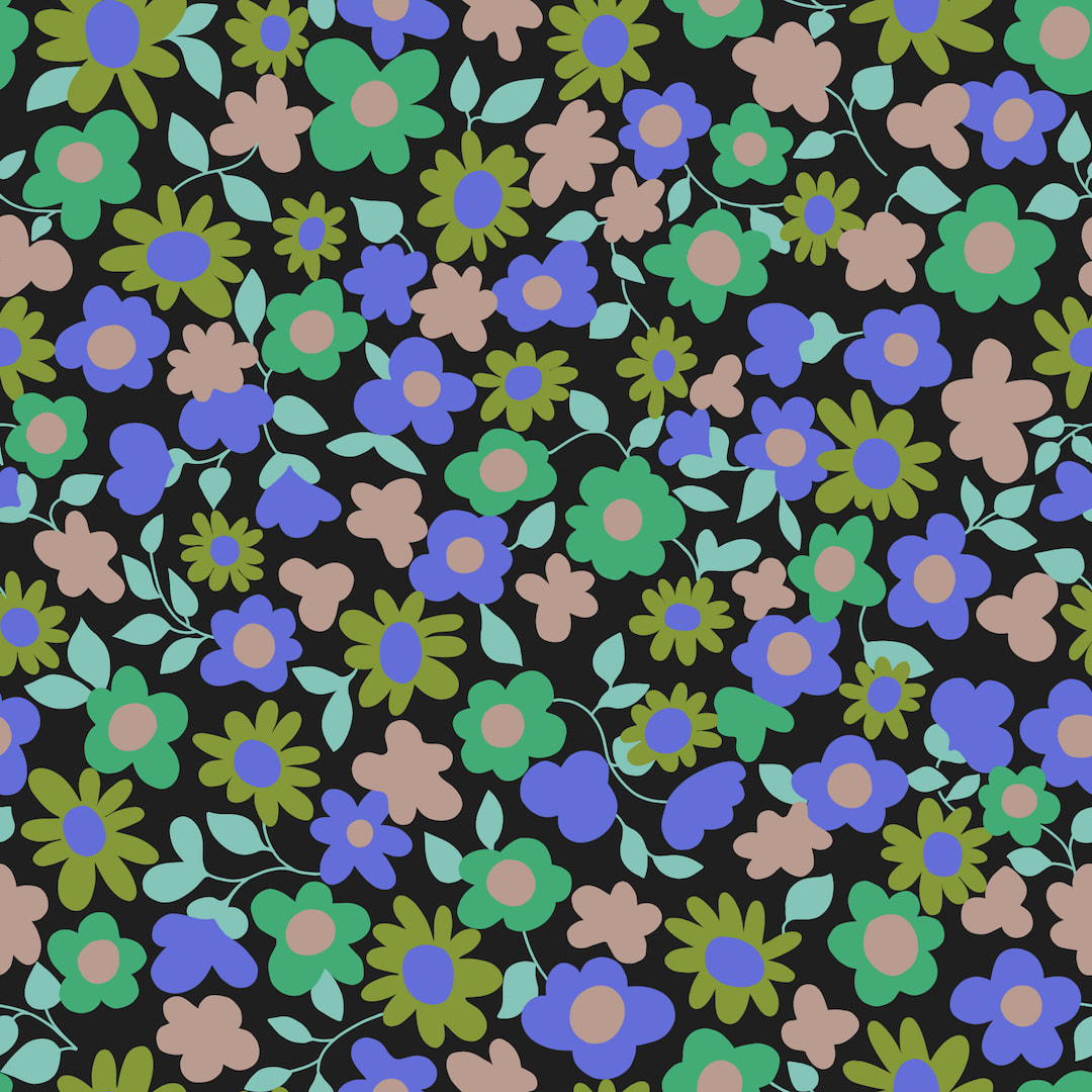 After carefully studying my own Spoonflower sampler and reading that review, I reworked my vintage tie daisy pattern. I decided the ink bleed alone was quite enough to soften the forms and that the original crayon work was a step too far, so this time I made the design as clean as a whistle in flat, clear colours. To my surprise, I really enjoyed the work and I love the final result, it looks like super-flat gouache or tempera paint. I have always been nervous of flat and clean work (nowhere to hide) but I think it's the best way to go for all future pattern designs.
I worked all five colour separations in two slightly different versions (the blue and green one is 'turned inside out'), so the sky's the limit for colourways, but I do love the dark background as on the vintage tie itself. Compare these with the first drawing made based on the tie. I like them both equally in their own ways, but the new version is the one I'll use for printing on fabric. Thanks for visiting, see you again soon! Comments are closed.
|

~~~~~~~~~~~~~~~~~~~~~~
Welcome to my illustration and patterns blog.
I illustrate under the pen-name of Binky McKee, McKee being my mother's maiden name. Binky was the name of every single cat my great-grandmother kept - allegedly about 40 of them during her 94 years of life. I changed the website address a few months ago, so some older links on previous posts are broken. If you click one of those and it takes you to a strange page, simply replace the .co.uk after the binkymckee. with weebly.com and it will work again. I hope you enjoy your visit! ~~~~~~~~~~~~~~~~~~~~~~
~~~~~~~~~~~~~~~~~~~~~~
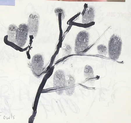
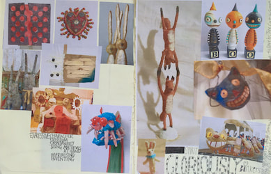
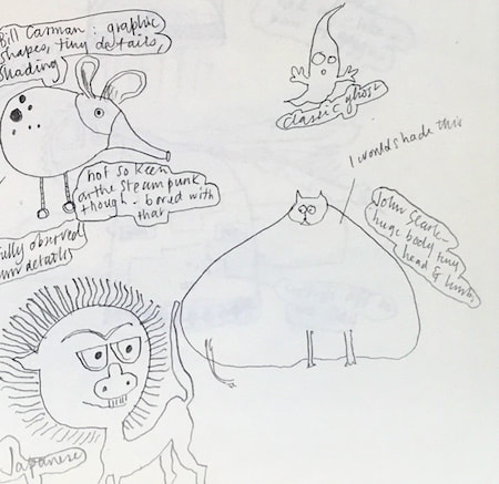
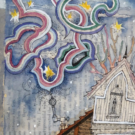
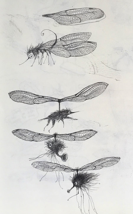
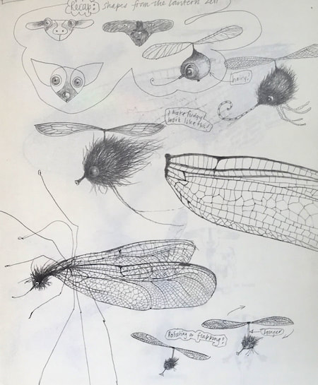
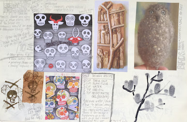
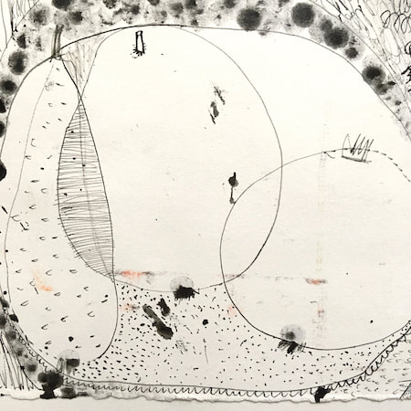
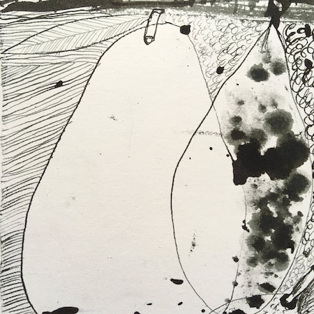
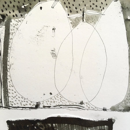
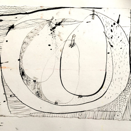
I keep lots of scrapbooks and sketchbooks where I develop ideas and design little creatures. Here's a peek inside one ...
~~~~~~~~~~~~~~~~~~~~~~
~~~~~~~~~~~~~~~~~~~~~~
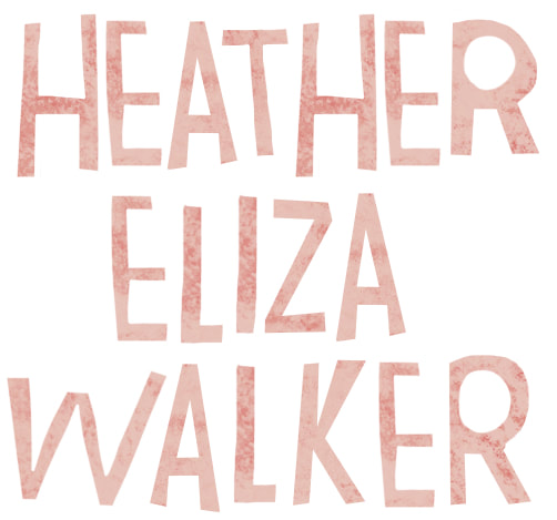
As you may know, I am also known as Heather Eliza Walker.
Click the image if you would like to find out more and visit my other website. ~~~~~~~~~~~~~~~~~~~~~~ ~~~~~~~~~~~~~~~~~~~~~
~~~~~~~~~~~~~~~~~~~~
April 2024
~~~~~~~~~~~~~~~~~~~~~~
~~~~~~~~~~~~~~~~~~
All
~~~~~~~~~~~~~~~~~~~~~~
~~~~~~~~~~~~~~~~~~~~~~
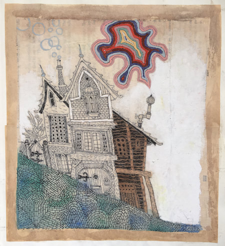
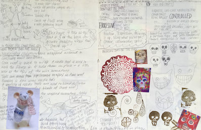
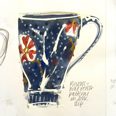
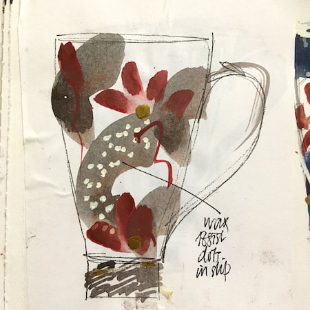
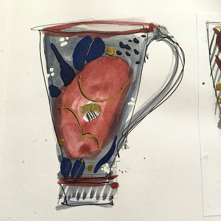
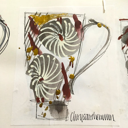
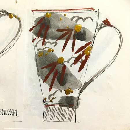
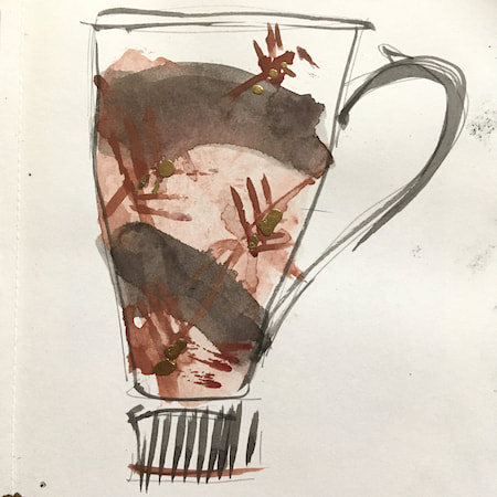
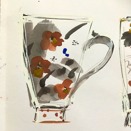
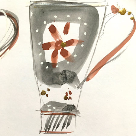
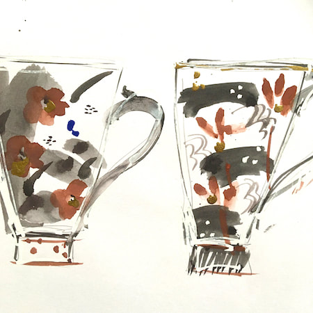
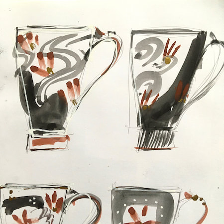
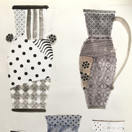
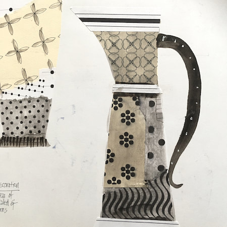
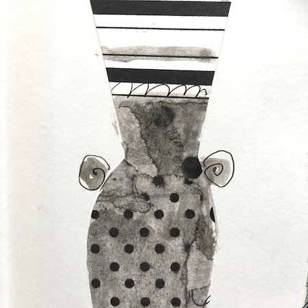
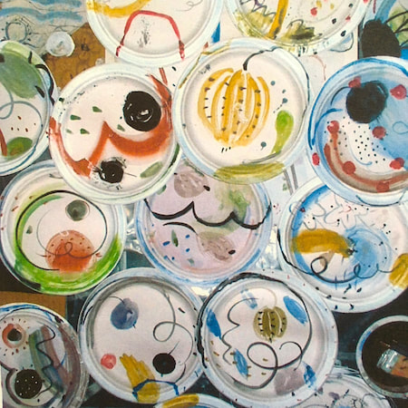
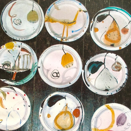
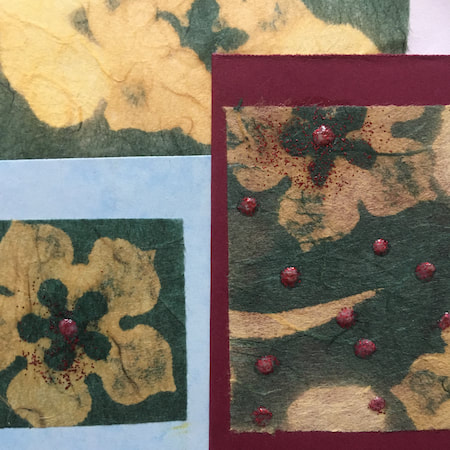
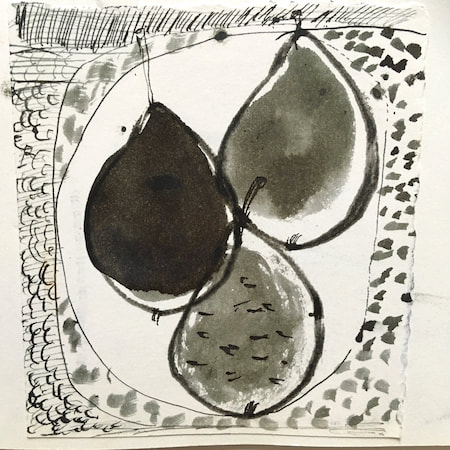
This time, take a peek into my ceramic design sketchbook. I actually made some of the mugs, but I kind of prefer the drawings! The plate designs are painted on paper plates, a most liberating process.
~~~~~~~~~~~~~~~~~~~~~~
~~~~~~~~~~~~~~~~~~~~~~
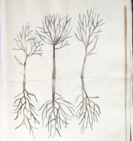
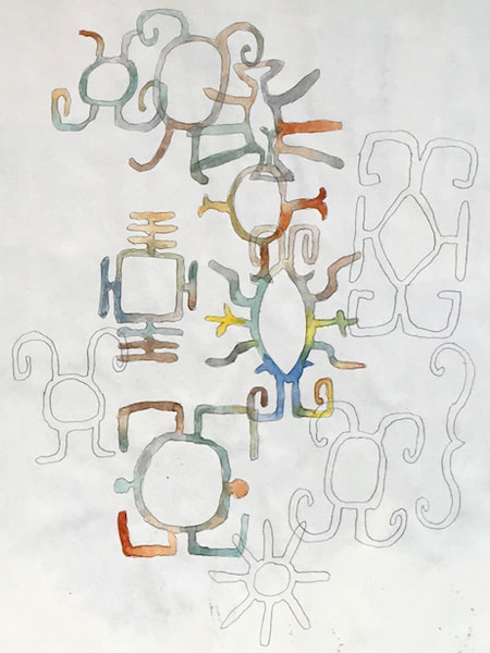
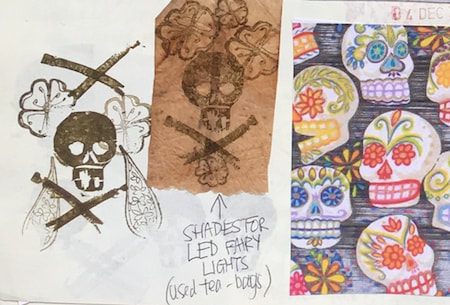
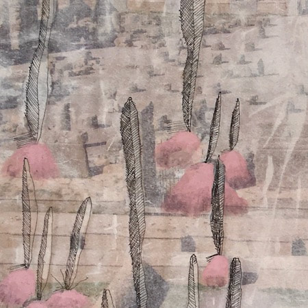
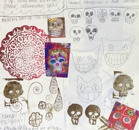
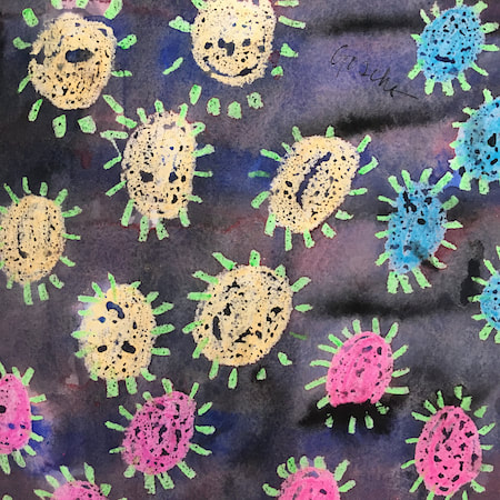
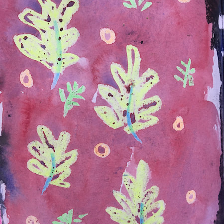
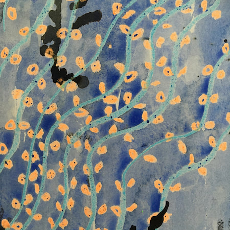
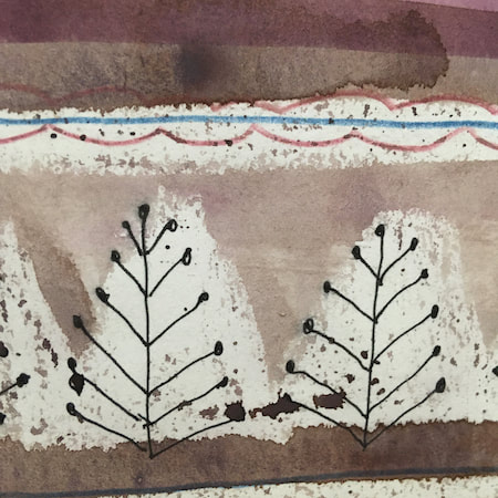
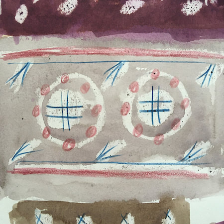
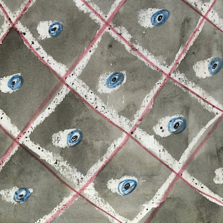
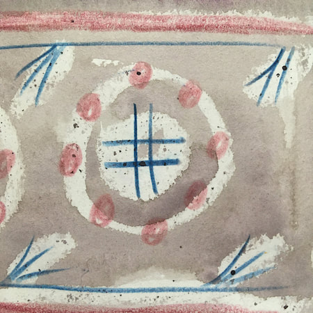
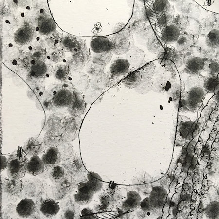
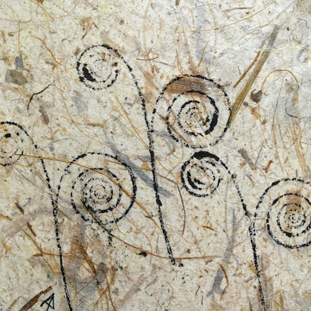
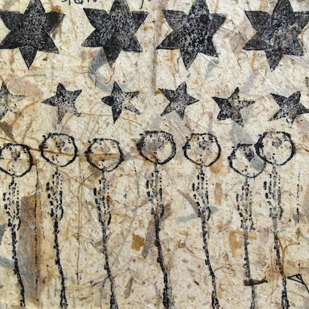
These watercolours are from my pattern sketchbook. I used coloured wax crayons to resist the washes of watercolour, also home-made rubber stamps dipped in bleach then printed on crêpe paper - the bleach takes out the paper dyes.
~~~~~~~~~~~~~~~~~~~~~~
~~~~~~~~~~~~~~~~~~~~~~
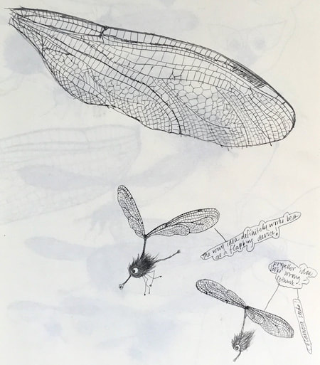
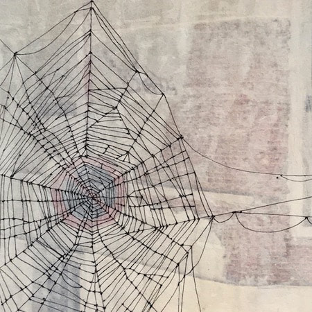
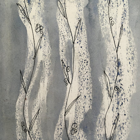
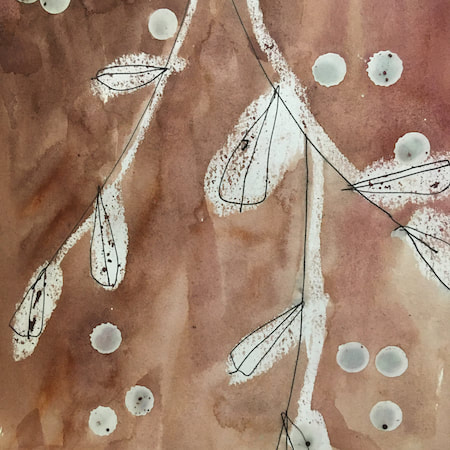
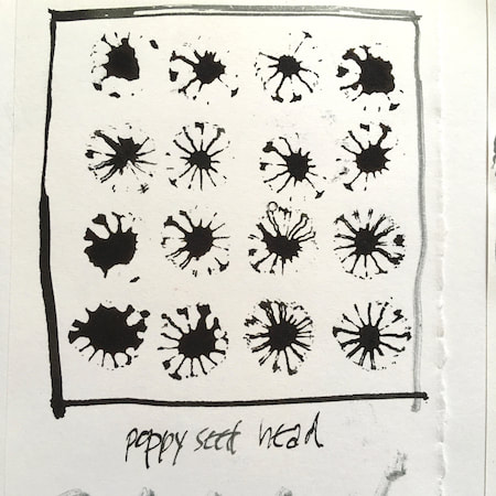
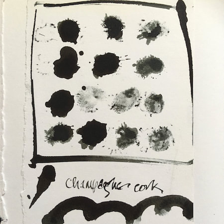
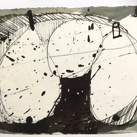
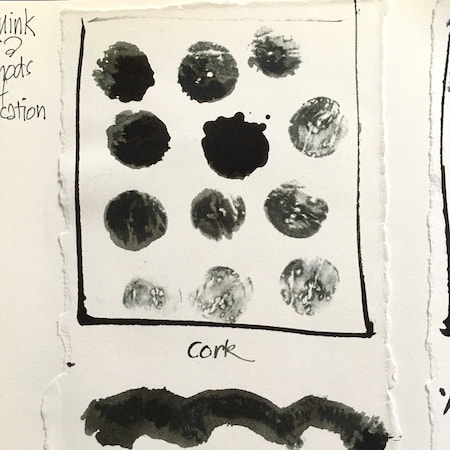
A sketchbook I used for mark-making with unusual objects - corks, seed-heads, feathers, home-made rubber stamps, my fingers and lots of flicky things ...
|
 RSS Feed
